The top 4 things that put customers OFF your website.

Think you have a great website, but stuck wondering why your bounce rate is a little steep? Why aren’t you getting the conversions you want? We here at Smart Little Web know that even the greatest business can’t survive with a less than satisfying sales site, so here are our hard and fast rules for converting more site visits to sales.
Poor homepage
Ugly design, mismatched colours, pixelated imagery, it all paints a horrifying picture to the first-time viewer. Someone’s landed on your site for a reason, they’re looking for a service to fix their problem. So, what do they not want to see? A poorly designed homepage that screams inconsistency, and a business that's not willing to put in the hours to get an attractive website. Research has found that first impressions are 94% design related, plus a whopping 75% of users judge a website's credibility based on the design. Scary stuff.
Here's an example of a website that seriously offends our design tastebuds (unsurprisingly we found this on http://www.webpagesthatsuck.com):

Ok, so maybe this is an exaggerated example, but why does this website fail so badly?
Colour
Not only do the colours need to come with a hazard warning, but they are inconsistent. Using a few different colours for your website is fine, but by making sure you are only picking from a predefined palette of shades, you easily ensure the customer has a more pleasant experience on your site.
Fonts
I can see about five different fonts used on this webpage, really, where is the need for this? Using a maximum of three fonts, for title, header and body copy will keep your site clean and easy to read.
Images
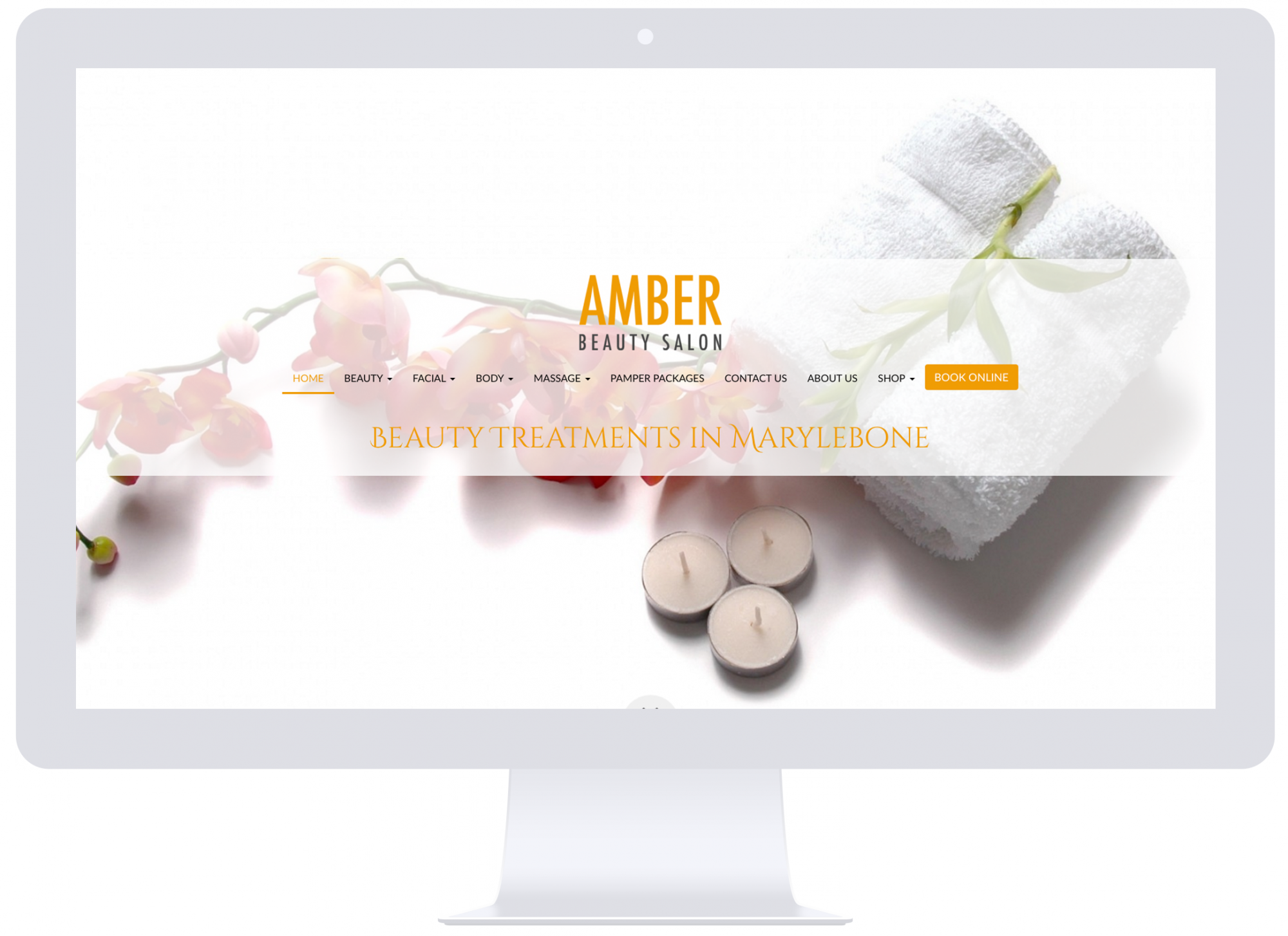
There’s just so many images on this website, all conflicting with the multiple colour and font choices. Simplicity is king here. A high quality, full-bleed image like on the Smart Little Websites below, would do a far better job of showcasing your business, and be a lot easier on the eyes.
Yawn-worthy copy
Talking to everyone is talking to no-one. How well do you really know your audience? This is the bit we hear over and over again, but it is stupidly important to get nailed down. Knowing your customer and being able to target them with your copy is probably the most important part of your marketing strategy, let alone your website!
To define your ideal customer, ask yourself who your audience are? What kind of lifestyle do they lead? What problems are they looking to you to solve? Speaking in a conversational style, getting to the point and addressing their business aches and pains are an all-round recipe for success.
Frustrating navigation
So your customer has landed on your site, then innocently wander over to your navigation and are hit with 16 different links, endless sub-menus and navigation titles that are practically sentences. Ok, so maybe this is an exaggeration, but if your website navigation is anything less than predictable, your users will likely abandon your site for the nearest competitor’s. The best thing you can do for your website right now is to take a step back, get someone to test it out for you, and get some honest feedback. Keeping your menu labels simple and obvious is the key here, try to avoid using obscure labels or words that your customers may not understand. Key menu labels such as ‘Home’, ‘About’, ‘Shop’ and ‘Blog’ are along the right lines, and from those pages you can then be a little more specific.
Poor mobile usability
Our lovely friends at Hubspot recently found that 48% of mobile and tablet users who arrive on a poor website, take that as a key indicator of a business that just doesn’t care. The flipside? 62% of businesses that designed their website specifically for mobile users had increased sales. The bottom line: your site must be mobile optimised. Can you really afford to turn away half of your audience?
Thankfully, all Smart Little Websites are 100% optimised for mobile straight off the bat, so you know your device users will be jumping for joy when they land on your site with a seamless experience.
What do YOU want them to do?
Just like failing to optimise for mobile is alienating half of your visitors, forgetting to add a CTA is missing a direct sale opportunity. After skimming through your website, your customers are (hopefully) thoroughly primed to take action, here is your ideal chance to give them a helpful nudge in the right direction with a Call to Action (CTA). Try to avoid screaming ‘I want your money!’ by giving your customers a thoughtful reason to buy, sign up or engage with your business. A great CTA does not sell your business directly, but instead outlines the benefits that taking action will bring to the customer.
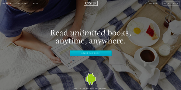
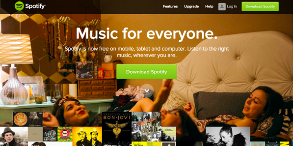
Some great Call to Action examples: notice how each CTA actively addresses a benefit that their audience desires.
A Call to Action does not just have to be a big button at the top of your page, a great way to increase the chances of your audience taking action, is to integrate a CTA within your content. For example, if you've written a paragraph on the products you sell, it then makes sense to have a button that states 'View my shop'. Then, if you were to have content around promotions and pricing, it makes sense to CTA with 'Sign up for email notifications and receive regular discount codes'.
There’s a million other ways your website could be putting your customers off, but we’ve tried our best to summarise our top tips for things you can action right now. Since we know the ins and outs of websites (and what makes a great one), we’ve solved all of the above in a next generation website builder for small businesses. Want to make yourself a better marketer in the process? We do that too.